Contact Us
Interested in getting a Custom Website with our team at MonkDev?
Talk with one of our team members. Our team will help you understand the strengths and weaknesses of your current site.
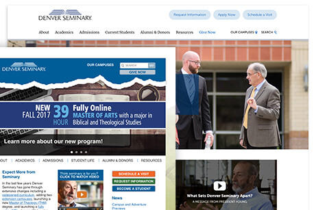
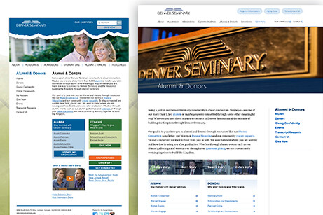
Denver Seminary has used Ekklesia 360 for a number of years. We have helped them grow and worked on several kinds of custom design work. Denver Seminary has had a fully custom site as well as a Bring Your Own Design (BYOD) project. This time around, we worked with their team to take their current site and make updates. We upgraded some features and functionality, and also created a new Home Page. We created a new Style Guide and refreshed all their site templates to reflect the updated, modern style.

The new site needed to allow visitors to take action toward becoming a student. On their old site, the calls to action were buried on a sidebar, as an impactful part of their redesign, we placed them in the header to ensure they were accessible from any page.

This project was not about starting from nothing, but taking the overall flow and content structure and giving it a design refresh. We simplified the color palette, added white space and designed modern accents to create a site that reflects the beautiful locations of the seminary.

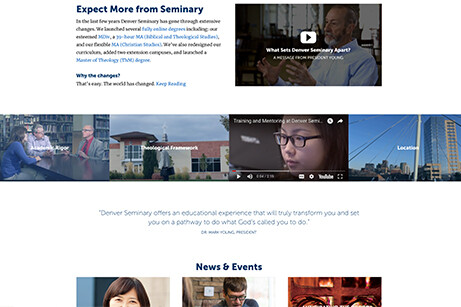
We wanted to highlight Denver Seminary’s media to paint a picture of their culture -- both in their academics and in the day-to-day life. We highlighted videos and large event images on the home page to show visitors what is important and what it is like to be a part of the community.